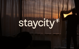

Staycity Aparthotels
Visual identity
Logo design, branding, art direction, concept
With KesselsKramer London, Adam Morton-Delaney, Lauren Coutts
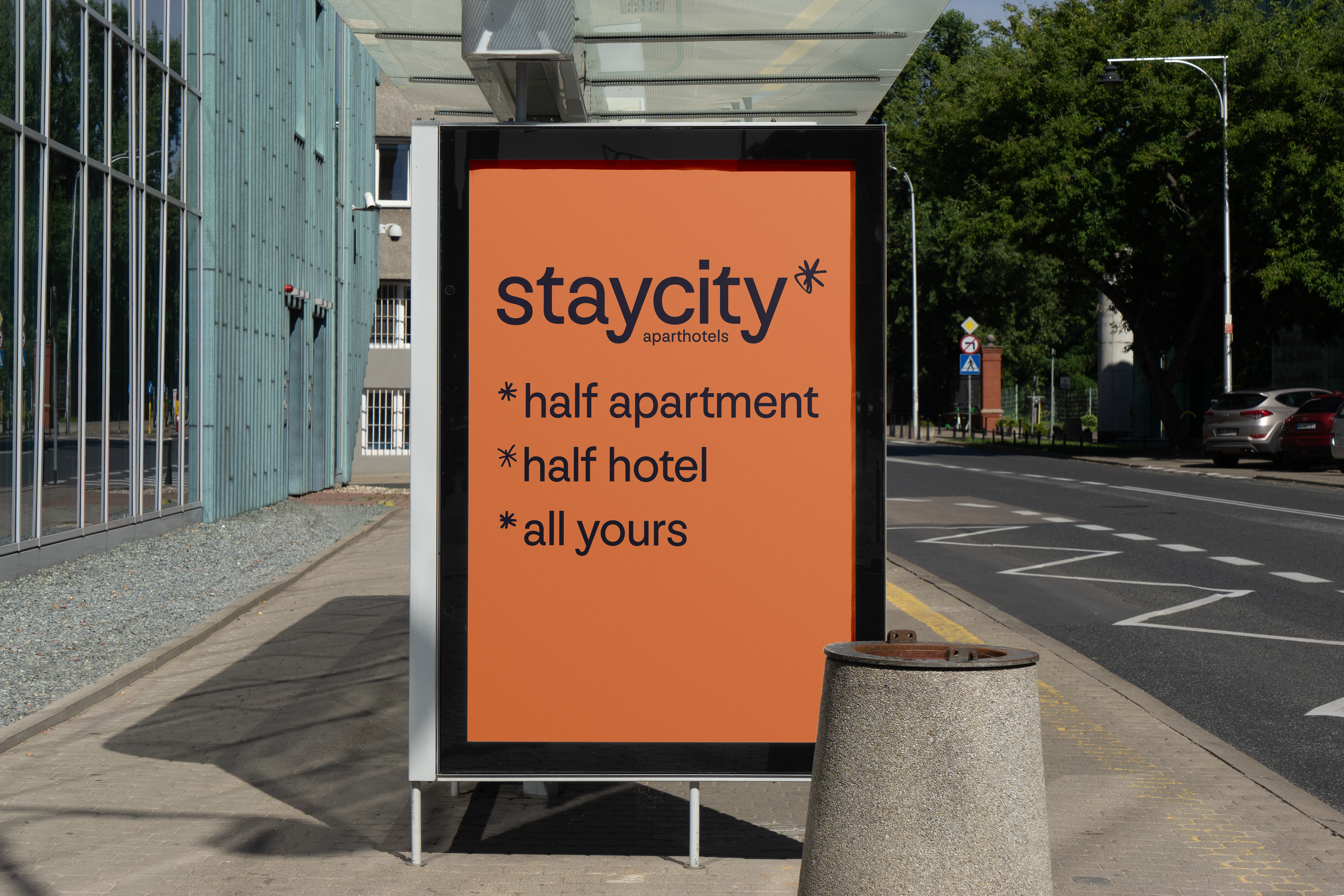
Half-apartment, half-hotel, Staycity prides itself in being the smart choice of stay for business, leisure and all the nuances in between. Now properly established, the brand needs
to make itself know.
The friendly smartness of the Staycity offer is at the center
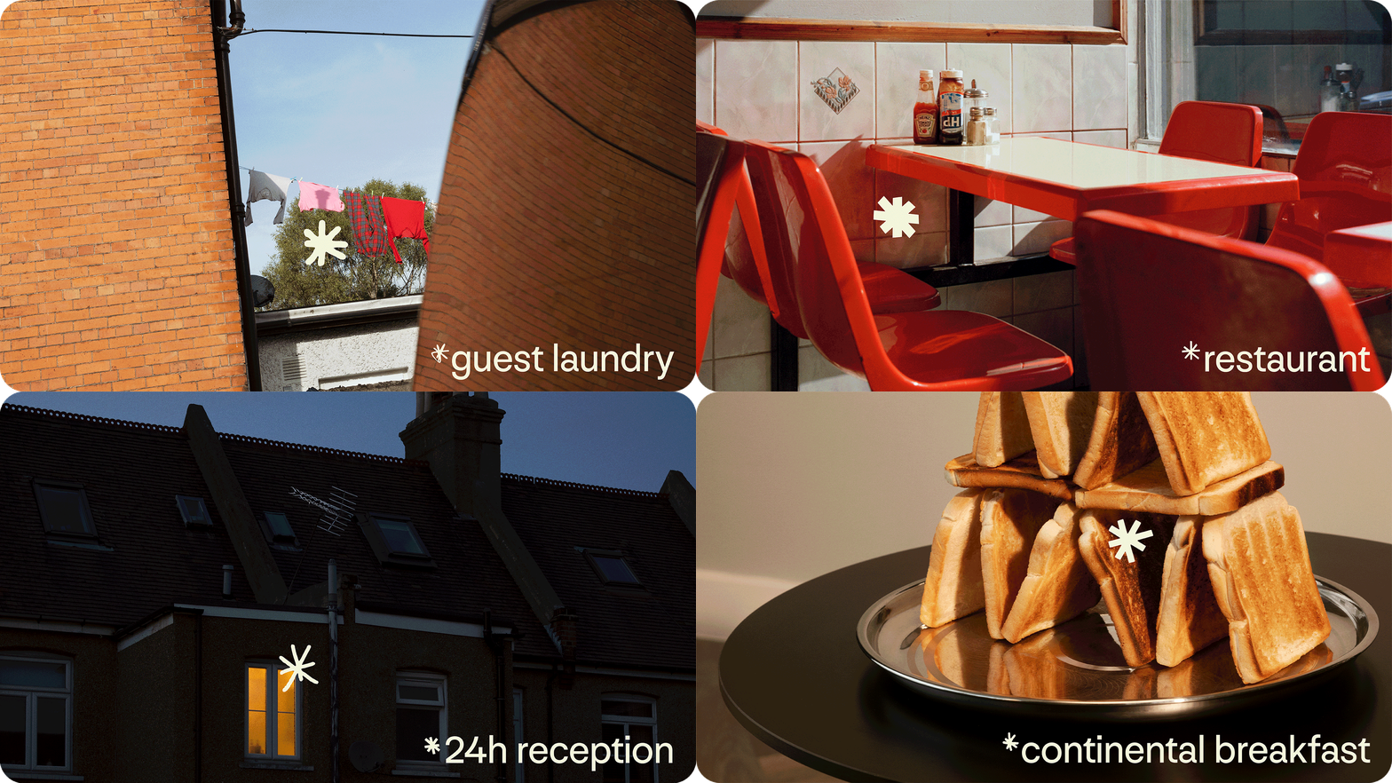
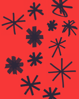
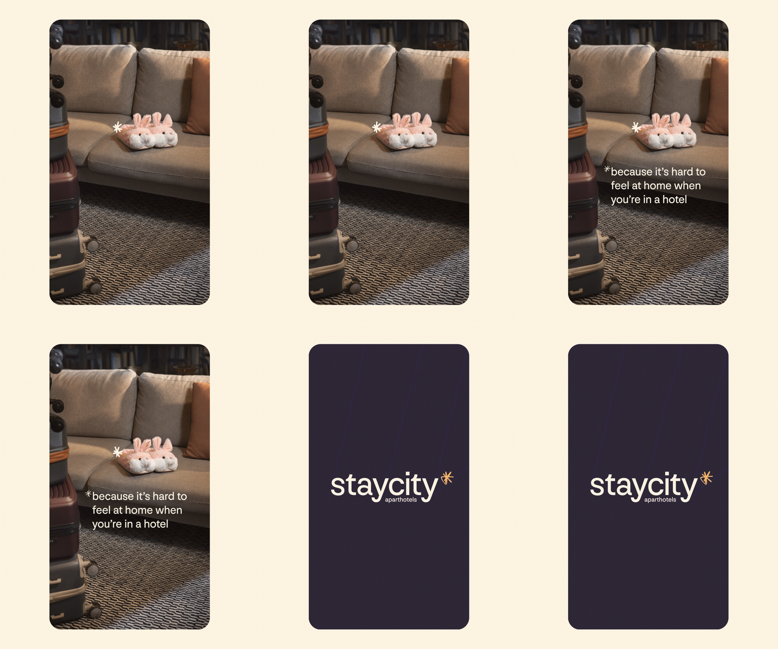
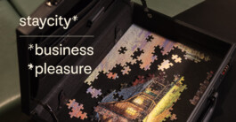
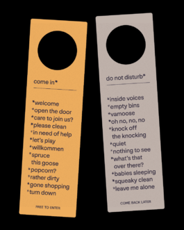
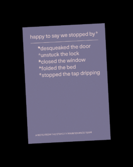
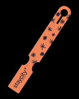
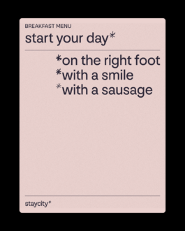
of the identity. Through the use of a suite of hand-drawn asterisks, layers of meaning and extra informations are added, showing to the guests with a bit of humour what they stay can offer.
This smart aspect is supported by a clean visual identity, using a sans-serif typeface and warm colours, with a clear and informative structure.
